import contextily
import geopandas as gpd
import matplotlib.pyplot as plt
import numpy as np
import pandas as pd
import pointpats
import seaborn as sns
from matplotlib import patches
from sklearn import clusterPoint pattern analysis
When you need to deal with point data, you will likely be interested in the spatial patterns they form. For that, you can use point pattern analysis techniques. This session will walk you through some basic ways of approaching the analysis based primarily on geometries and their locations rather than variables associated with them.
Data
In this session, you will be using data on pedestrian accidents in Brno that happened since 2010. Every accident is marked with point geometry and assigned a range of relevant variables you are free to explore by yourself. The dataset is released by Brno municipality under CC-BY 4.0 license. It has been preprocessed for the purpose of this course. If you want to see how the table was created, a notebook is available here.
As always, you can read data from a file posted online, so you do not need to download any dataset:
accidents = gpd.read_file(
"https://martinfleischmann.net/sds/point_patterns/data/brno_pedestrian_accidents.gpkg"
)
1accidents.explore("rok", tiles="CartoDB Positron", cmap="magma_r")- 1
-
"rok"is a column with the year in which an accident occurred. The variables are in Czech.
Make this Notebook Trusted to load map: File -> Trust Notebook
NoteAlternative
Instead of reading the file directly off the web, it is possible to download it manually, store it on your computer, and read it locally. To do that, you can follow these steps:
- Download the file by right-clicking on this link and saving the file
- Place the file in the same folder as the notebook where you intend to read it
- Replace the code in the cell above with:
accidents = gpd.read_file(
"brno_pedestrian_accidents.gpkg",
)Visualisation
The first step you will likely do is some form of visualisation. Either as an interactive map like the one above or using one of the more advanced methods. Most of the methods you will be using today do not necessarily depend on geometries but on their coordinates. Let’s start by extracting coordinates from geometries and assigning them as columns.
accidents[["x", "y"]] = accidents.get_coordinates()
accidents.head(2)| den | rok | mesic | zavineni | viditelnost | cas | mesic_t | doba | den_v_tydnu | alkohol | ... | kategorie_chodce | stav_chodce | chovani_chodce | situace_nehody | prvni_pomoc | nasledky_chodce | nazev | geometry | x | y | |
|---|---|---|---|---|---|---|---|---|---|---|---|---|---|---|---|---|---|---|---|---|---|
| 0 | 4 | 2010 | 4 | chodcem | ve dne, viditelnost nezhoršená vlivem povětrno... | 1340 | duben | den | čtvrtek | Ne | ... | muž | nepozornost, roztržitost | špatný odhad vzdálenosti a rychlosti vozidla | přecházení mimo přechod (2O a více metrů od př... | nebylo třeba poskytnout | bez zranění | Brno-Starý Lískovec | POINT (-601201.157 -1164285.355) | -601201.157 | -1164285.355 |
| 1 | 6 | 2010 | 6 | řidičem motorového vozidla | ve dne, viditelnost nezhoršená vlivem povětrno... | 1560 | červen | den | sobota | Ne | ... | jiná skupina | nezjištěno | žádné z uvedených | jiná situace | vozidlem RZP | lehké zranění | Brno-jih | POINT (-597104.108 -1165612.168) | -597104.108 | -1165612.168 |
2 rows × 40 columns
Scatter plots and distributions
Any geographical plot of points is essentially a scatter plot based on their x and y coordinates. You can use this to your advantage and directly apply visualisation methods made for scatterplots. seaborn is able to give you a scatter plot with histograms per each axis.
- 1
-
jointplottakesaccidentsas a source DataFrame and plots column"x"on x-axis and column"y"on y-axis.s=1sets the size of each point to one. - 2
-
Use
contextilyto add a basemap for a bit of geographic context. - 3
- Rotate labels of ticks on x-axis to avoid overlaps.
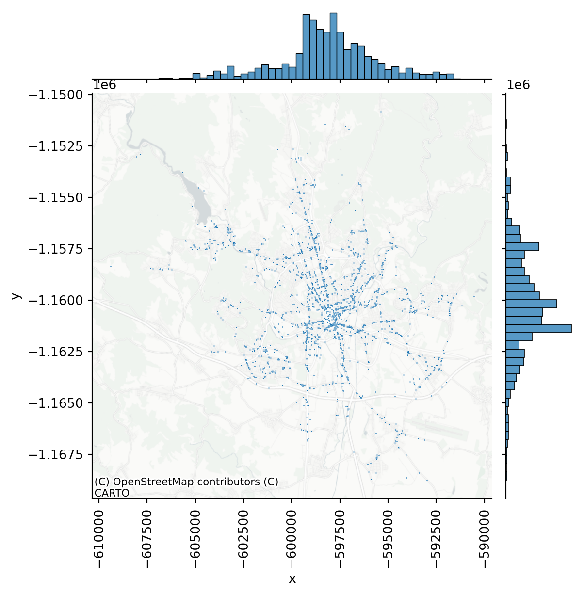
This plot is useful as it indicates that the point pattern has a tendency to be organised around a single centre (both histograms resemble normal distribution). From the map, you can see that the majority of incidents happened along main roads (as one would expect), but showing raw points on a map is not the best visualisation method. You can conclude that the pattern is not random (more on that later).
Showing all the points on a map is not that terrible in this case as there’s not that many of them. However, even in this case, you face the issue of clusters of points being hidden behind a single dot and similar legibility drawbacks. You can overcome it it many ways, so let’s showcase two of them - binning and density estimation.
Hexagonal binning
Binning is, in principle, a spatial join between the point pattern and an arbitrary grid overlaid on top. What you are interested is the number of points that fall into each grid cell. An example can be hexagonal binning, when the arbitrary grid is composed of hexagons. You could do it using geospatial operations in geopandas but since you have just points and all you now want is a plot, you can use hexbin() method from matplotlib.
1f, ax = plt.subplots()
2accidents.plot(ax=ax, markersize=0.05)
3hb = ax.hexbin(
accidents["x"],
accidents["y"],
gridsize=25,
linewidths=0,
alpha=0.5,
cmap="magma_r",
4 mincnt=1,
)
# Add basemap
contextily.add_basemap(
ax=ax,
crs=accidents.crs,
source="CartoDB Positron No Labels",
)
# Add colorbar
5plt.colorbar(hb)
plt.xticks(rotation=90);- 1
-
Create an empty
matplotlibfigure. - 2
- Add points.
- 3
-
Create a
hexbinlayer with 25 cells in x-direction. - 4
- Show only the cells with a minimal count of 1.
- 5
- Add colour bar legend to the side.
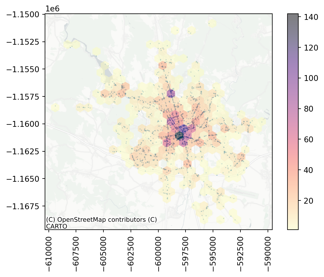
Hexbin gives you a better sense of the density of accidents across the city. There seems to be a large hotspot in the central areas and a few other places that seem to be more dangerous.
Kernel density estimation
Density can be estimated by binning, but that will always result in abrupt changes when two cells meet, like with a histogram. The other option is to use 2-dimensional kernel density estimation to generate contours of different (interpolated) levels of density. If you are interested in a plot and not geometry of contour lines, pointpats offers a handy function called plot_density().
f, ax = plt.subplots()
accidents.plot(ax=ax, markersize=0.05)
pointpats.plot_density(
accidents,
bandwidth=500,
1 levels=25,
alpha=0.55,
cmap="magma_r",
linewidths=1,
ax=ax,
)
contextily.add_basemap(
ax=ax,
crs=accidents.crs,
source="CartoDB Positron No Labels",
)- 1
-
n_levelsspecifies the number of contour lines to show.
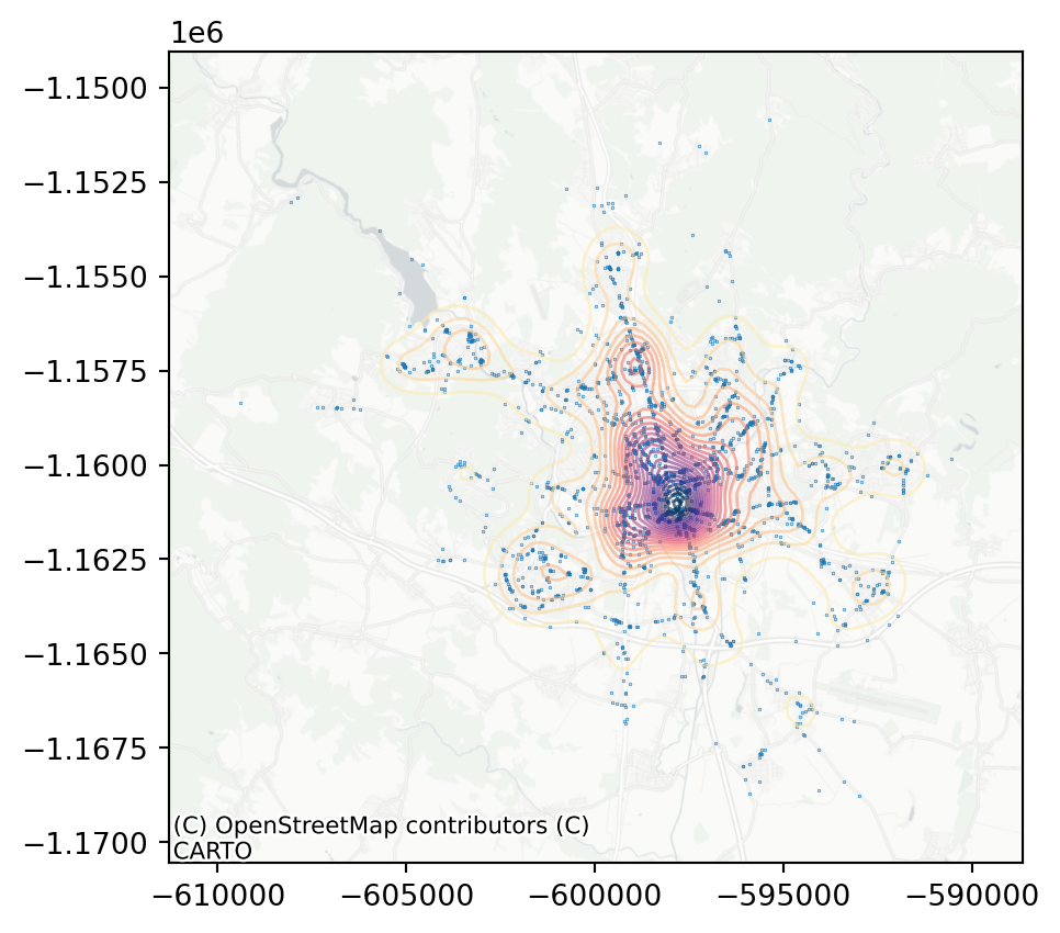
The intuition about the dominance of the city centre in the dataset is shown here very clearly. What have all of these visualisations in common is that they can be used to build intuition and a first insight into the pattern but as data scientists, you will probably need some numbers characterising your data.
Centrography
Centrography aims to provide a summary of the pattern. What is the general location of the pattern, how dispersed is it, or where are its limits. You can imagine it as what pandas.DataFrame.describe() returns but for the point pattern. Rey, Arribas-Bel, and Wolf (2023) cover assessments of tendency, dispersion and extent.
The tendency can be reflected by the centre of mass represented usually as the mean or median of point coordinates. PySAL has a module dedicated to point patterns called pointpats, that allows you to measure these easily, just based on a GeoPandas object with point geometry or an array of X and Y coordinates.
mean_center = pointpats.centrography.mean_center(accidents)
med_center = pointpats.centrography.euclidean_median(accidents)On some occasions, you may want to take into account some external variables apart from the geographical location of each point. Simply because not every accident is as serious as the other. You can use weighted_mean_center to measure mean weighted by any arbitrary value. In the case of accidents, you may be interested in mean weighted by the number of injured people.
weighted_mean = pointpats.centrography.weighted_mean_center(
1 accidents, accidents["lehce_zran_os"]
)- 1
-
Column
"lehce_zran_os"represents the number of people with minor injuries resulting from each accident.
What you get back for each of these are coordinates of a single point that is, to some degree, representative of the pattern.
weighted_mean.x, weighted_mean.y(-598188.5290827141, -1160167.630450745)Dispersion can be reflected by the standard deviation or, better, by the ellipse based on the standard deviations in both directions since you are dealing with two-dimensional data. The pointpats.centrography can also do that, giving you back the semi-major and semi-minor axes and their rotation.
ellipse = pointpats.centrography.ellipse(accidents)
ellipse
You can then use the information in any way you like, but it is likely that you will want to plot the results of centrography on a map. The plot is a bit more complicated than those before, but it is just because there are more layers. However, do not feel the need to reproduce it.
Code
f, ax = plt.subplots()
accidents.plot(ax=ax, markersize=0.05)
1ax.scatter(*mean_center.xy, color="k", marker="o", label="Mean Center", alpha=0.8)
ax.scatter(*med_center.xy, color="r", marker="o", label="Median Center", alpha=0.8)
ax.scatter(
*weighted_mean.xy,
color="pink",
marker="o",
label="Weighted Mean Center",
alpha=0.8
)
gpd.GeoSeries([ellipse.boundary], crs=accidents.crs).plot(
ax=ax,
color="red",
linestyle="--"
)
3ax.legend(loc="upper left")
contextily.add_basemap(
ax=ax,
crs=accidents.crs,
source="CartoDB Positron No Labels",
)
plt.xticks(rotation=90);- 1
- Plot 3 scatters, each with one point only to mark centres of mass.
- 3
- Add legend to the upper left corner.
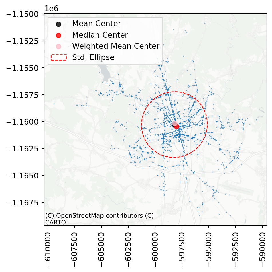
You can see that in this specific case, all three ways of computing centre of the mass are within a short distance from each other, suggesting the dataset is pretty balanced. A similar conclusion can be made based on the shape of the ellipse, which nearly resembles a circle.
A useful application of centrography is when you need to compare mutliple point patterns. Have a look at the difference between accidents that happened during the day and at night (column "doba", where “den” means day and “noc” means night).
day = accidents[accidents["doba"] == "den"]
night = accidents[accidents["doba"] == "noc"]As always, start with visual exploration.
f, axs = plt.subplots(1, 2, sharey=True)
day.plot(color="red", markersize=.05, ax=axs[0])
night.plot(color='blue', markersize=.05, ax=axs[1])
for ax in axs:
ax.set_axis_off()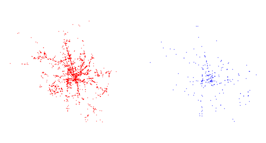
Focus on the ellipse. What does it say about the patterns? How does it change and why?
mean_center_day = pointpats.centrography.mean_center(day)
mean_center_night = pointpats.centrography.mean_center(night)
ellipse_day = pointpats.centrography.ellipse(
day
)
ellipse_night = pointpats.centrography.ellipse(
night
)Compare the two ellipses visually on a map.
Code
f, ax = plt.subplots()
accidents.plot(ax=ax, markersize=0.05)
ax.scatter(*mean_center_day.xy, color="red", marker="o", label="Mean Center [Day]", alpha=0.8)
gpd.GeoSeries([ellipse_day.boundary], crs=accidents.crs).plot(
ax=ax,
color="red",
linestyle="--"
)
ax.scatter(*mean_center_night.xy, color="blue", marker="o", label="Mean Center [Night]", alpha=0.8)
gpd.GeoSeries([ellipse_night.boundary], crs=accidents.crs).plot(
ax=ax,
color="blue",
linestyle="--"
)
ax.legend(loc="upper left")
contextily.add_basemap(
ax=ax,
crs=accidents.crs,
source="CartoDB Positron No Labels",
)
plt.xticks(rotation=90);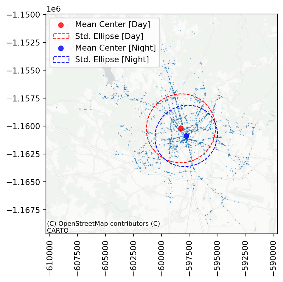
As you can see, the night ellipse is slightly smaller and centred closer to the centre of Brno than the day ellipse. You can probably guess why.
TipExtent
The last part of centrography worth mentioning here are ways of characterisation of pattern’s extent. This is not covered in this material but feel free to jump directly to the relevant section of the Point Patterns chapter by Rey, Arribas-Bel, and Wolf (2023).
All centrography measures are crude simplifications of the pattern like summary statistics is a for non-spatial data. Let’s move towards some more profound methods of analysis.
Randomness and clustering
Point patterns can be random but more often then not, they are not random. You main question when looking at the observations can be targetting specifically this distinction. Is, whatever I am looking at, following some underlying logic or is it random? The first method that helps answering such questions is quadrat statistic.
Quadrat statistic
Imagine a grid overlaid over the map, similar to those you can use for visualisation. Each of them contains a certain number of points of the pattern. Quadrat statistics “examine the evenness of the distribution over cells using a \(\chi^2\) statistical test common in the analysis of contingency tables.” (Rey, Arribas-Bel, and Wolf 2023). It compares the actual distribution of points in cells to that, that would be present if the points were allocated randomly.
pointpats allows you to compute the statistics using the QStatistic class, which takes any GeoPandas object of points or an array of coordinates and some optional parameters specifying the details.
1qstat = pointpats.QStatistic(accidents, nx=6, ny=6)- 1
-
nxandnyspecify the number of cells along the x and y axis, respectively. The default is 3.
The class then offers a range of statistical values in a similar way you know from those in esda, you used last time. For example, the observed \(\chi^2\) statistics can be accessed using .chi2.
qstat.chi2np.float64(11450.396617986164)And it’s \(p\)-value, indicating significance using chi2_pvalue.
qstat.chi2_pvaluenp.float64(0.0)In our case, it is clear that the points are not evenly distributed across the cells, hence the point pattern is unlikely to be random. A helpful visual illustration of how the quadrat overlay works is when you plot the grid on top of the underlying point pattern.
ax = qstat.plot()
contextily.add_basemap(
ax=ax,
crs=accidents.crs,
source="CartoDB Positron No Labels",
)
plt.xticks(rotation=90);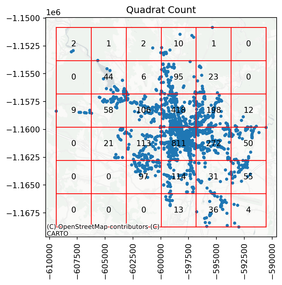
You can see that there are cells with more than 800 observations, while some others have tens or even zeros.
Ripley’s functions
A better option for the assessment of the randomness of a point pattern is a family of statistical methods called Ripley’s alphabet. These functions tend to work with the concept of nearest neighbours and aim to capture the co-location of points in the pattern.
Before working with any of those, let’s quickly look at the Quadrat statistic plot above. Some of the cells contain 0 points simply because the extent of the point pattern is smaller than the bounding box of the area. Since Ripley’s functions are based on the generation of random point patterns within the extent of the analysed one, a situation like this might unnecessarily skew the results. To minise this effect, you want to perform the test only within the area of the existing point pattern.
While you can define such an extent in many way, a simple and often very suitable method is to define a concave hull of the point pattern to limit the possible space where modelled point locations may occur. You can do that directly with geopandas.
1concave_hull = accidents.dissolve().concave_hull(ratio=.1)- 1
- First, create a union of all points into a single MultiPoint and then get a convex hull of that.
The resulting object is a shapely.Polygon. If you wrap it in a geopandas.GeoSeries, you can easily plot it:
ax = accidents.plot(markersize=0.05)
concave_hull.plot(
1 ax=ax, facecolor="none", edgecolor="k", linestyle="--"
)
plt.xticks(rotation=90);- 1
-
To show just the boundary of a polygon, you can either pass
facecolor="none"or extract the.boundaryand plot that.
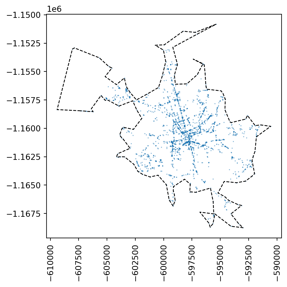
This allows us to limit the test to the area where something already happens.
\(G\) function
Ripley’s \(G\) is an iterative algorithm. It measures how many points have the nearest point within a threshold distance while repeatedly increasing such a threshold. A series of thresholds and counts then results in a specific curve that is compared to the curve coming from the purely random point pattern.
pointpats allows you to compute Ripley’s \(G\) using the g_test function.
- 1
- Practically, the number of bins of the distance between neighbours. More ensures better precision of resulting curves.
- 2
- Keep simulated data so you can plot them later.
- 3
-
Limit the test only to the
concave_hull. You need to extract the shapely geometry. - 4
- Number of simulations used as a baseline.
The intuition behind the statistic can be built based on the plot of the \(G\) values per distance threshold, comparing the observed results with those based on simulated random point patterns.
f, ax = plt.subplots()
1ax.plot(g_test.support, g_test.simulations.T, color="lightgrey")
2ax.plot(
g_test.support,
np.median(g_test.simulations, axis=0),
color="k",
label="median simulation",
linestyle="--",
)
3ax.plot(g_test.support, g_test.statistic, label="observed", color="red")
4ax.set_xlabel("distance [m]")
ax.set_ylabel(
"ratio of nearest neighbor\n"
"distances shorter than distance"
)
ax.legend()
5ax.set_xlim(0, 500);- 1
- Plot all simulations as light grey lines. They will merge into a thicker one, indicating a range of possible random solutions.
- 2
- Plot the median of simulations on top.
- 3
- Plot the observed \(G\) statistic.
- 4
- Label the x-axis and y-axis.
- 5
- Limit plot to show only distances between 0 and 500m. The rest is not interesting.
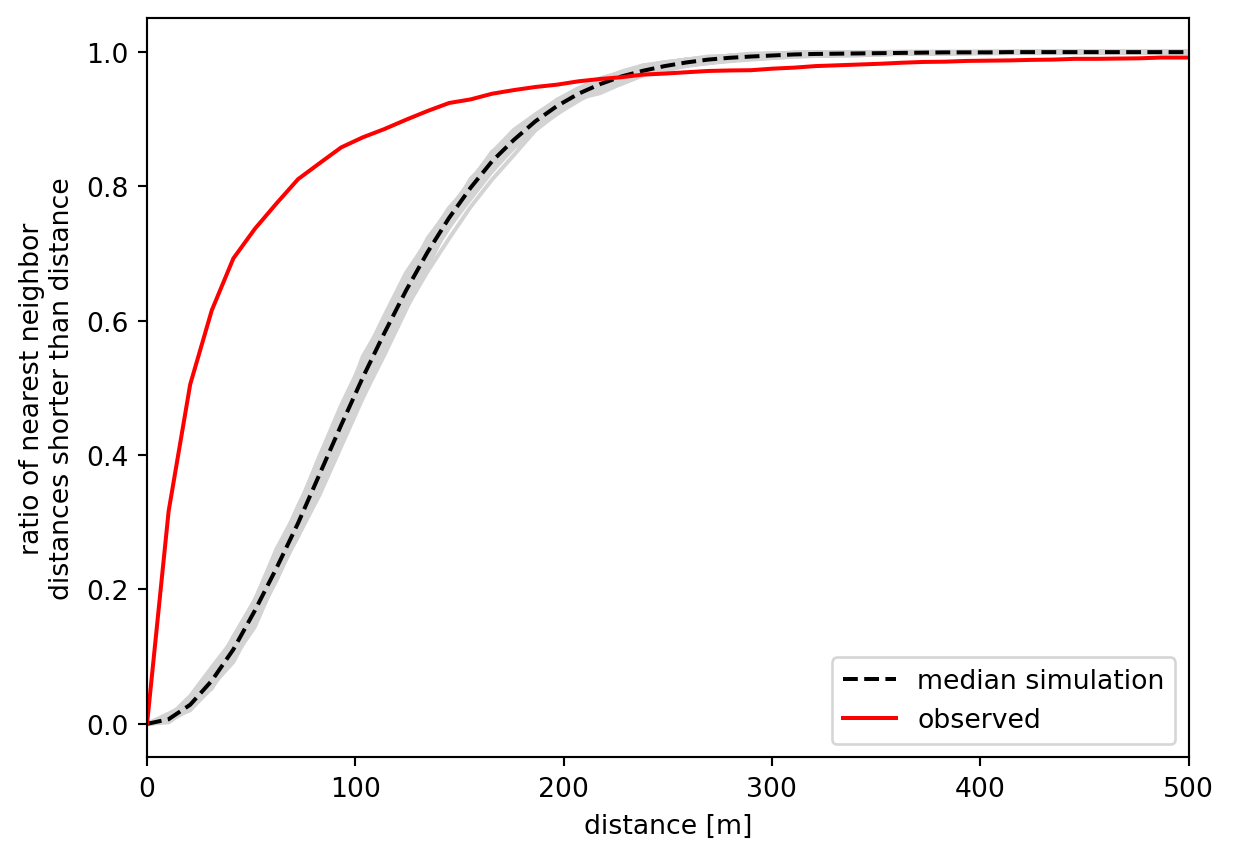
The x-axis shows the distance threshold, while the y-axis shows the ratio of points whose nearest neighbour is closer than the distance. This curve resembles a sigmoid function in its shape when the point pattern is random, as illustrated by the simulations. For non-random patterns, the ratio tends to grow much quicker as points are more clustered in space, making the nearest neighbours closer than the random ones would be. Since we see this distinction clearly, we can assume that the point pattern of pedestrian accidents is spatially clustered. The available \(p\)-value can also back the significance of this observation.
np.mean(g_test.pvalue)np.float64(0.0028000000000000004)\(F\) function
Another part of the Ripley’s alphabet is the \(F\) function. It is similar as \(G\) in its iterative nature based on a distance threshold but instead of focusing on distances between points within a pattern, if looks at the distance to points from locations in empty space. It captures how many points can be reached within a distance from a random point pattern generated within the same extent (that is why passing the hull is essential).
pointpats allows you to compute Ripley’s \(F\) using the f_test function.
f_test = pointpats.distance_statistics.f_test(
accidents,
support=200,
keep_simulations=True,
hull=concave_hull.item(),
n_simulations=99,
)Again, it is easier to understand the function from the plot. Patterns clustered in space tend to have larger empty spaces between their clusters, leading to a slower increase of \(F\) than what would happen for a random point pattern. That is precisely what you can see in the figure below.
f, ax = plt.subplots()
ax.plot(f_test.support, f_test.simulations.T, color="lightgrey")
ax.plot(
f_test.support,
np.median(f_test.simulations, axis=0),
color="k",
label="median simulation",
linestyle="--",
)
ax.plot(f_test.support, f_test.statistic, label="observed", color="red")
ax.set_xlabel("distance")
ax.set_ylabel("ratio of points within a distance threshold")
ax.legend()
ax.set_xlim(0, 2000);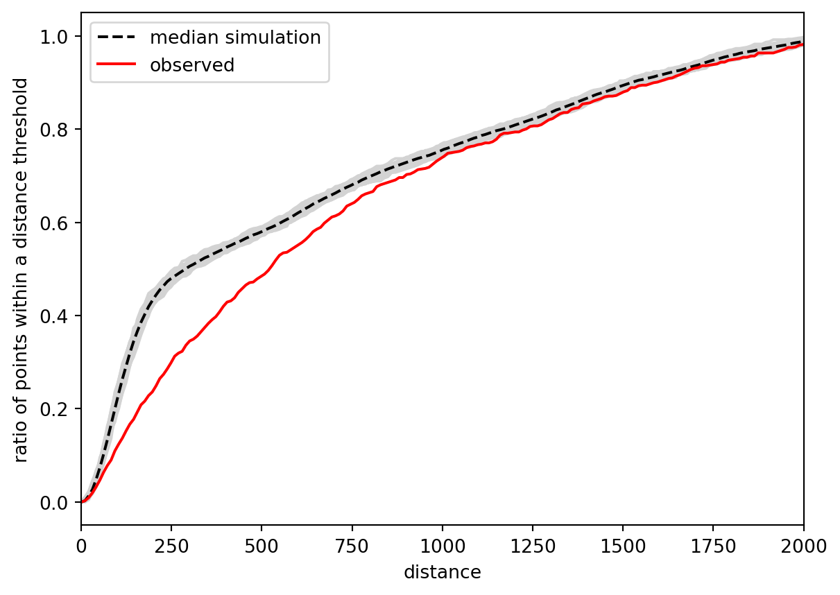
The observed curve of the \(F\) function is clearly below the simulated, meaning that it increases more slowly than it should if it were a random pattern. You can conclude the same as above: the pattern is clustered. For completeness, you can check the \(p\)-value.
np.mean(f_test.pvalue)np.float64(0.020650000000000005)There’s one key difference in the result compared to the \(G\) function - the \(F\) function result is not significant if we use the significance threshold 0.01 but it is with the more common threshold of 0.05.
Locating clusters
Knowing that there is a degree of clustering is often enough but there may be cases where you need to understand where the local clusters of points are. There are many ways of doing so, but one of the most common is DBSCAN (Density-Based Spatial Clustering of Applications). While the algorithm itself generalises to any data, when applied to point pattern coordinates, it behaves as a spatial explicit method. As the name suggests, it looks at the density of points and determines whether there is a cluster or not. It expects a single argument - the epsilon representing the distance threshold, used as the maximum distance between two samples for one to be considered as in the neighborhood of the other. Additionally, you can specify the minimal number of points that need to be within the epsilon of a point for it to be consider a core point of a cluster. See the detailed explanation in the attached additional reading or in the documentation of scikit-learn.
Use 100 meters as the epsilon to start with.
dbscan_100 = cluster.DBSCAN(eps=100)
dbscan_100.fit(accidents[["x", "y"]])DBSCAN(eps=100)In a Jupyter environment, please rerun this cell to show the HTML representation or trust the notebook.
On GitHub, the HTML representation is unable to render, please try loading this page with nbviewer.org.
Parameters
| eps | 100 | |
| min_samples | 5 | |
| metric | 'euclidean' | |
| metric_params | None | |
| algorithm | 'auto' | |
| leaf_size | 30 | |
| p | None | |
| n_jobs | None |
The resulting dbscan_100 object contains all the information about clusters, most important of which are the cluster labels.
dbscan_100.labels_array([-1, -1, -1, ..., 13, -1, -1], shape=(2602,))This is an array aligned with your points where -1 represents noise and any other value represents a cluster label. You can use it to split the noise from clusters.
noise = accidents[dbscan_100.labels_ == -1]
clusters = accidents[dbscan_100.labels_ != -1]This allows you to check where there are some clusters of accidents, which may lead to some changes to the streetscape, making it safer in future.
ax = noise.plot(markersize=.05)
clusters.plot(ax=ax, markersize=.05, color='red')
contextily.add_basemap(
ax=ax,
crs=accidents.crs,
source="CartoDB Positron No Labels",
)
plt.xticks(rotation=90);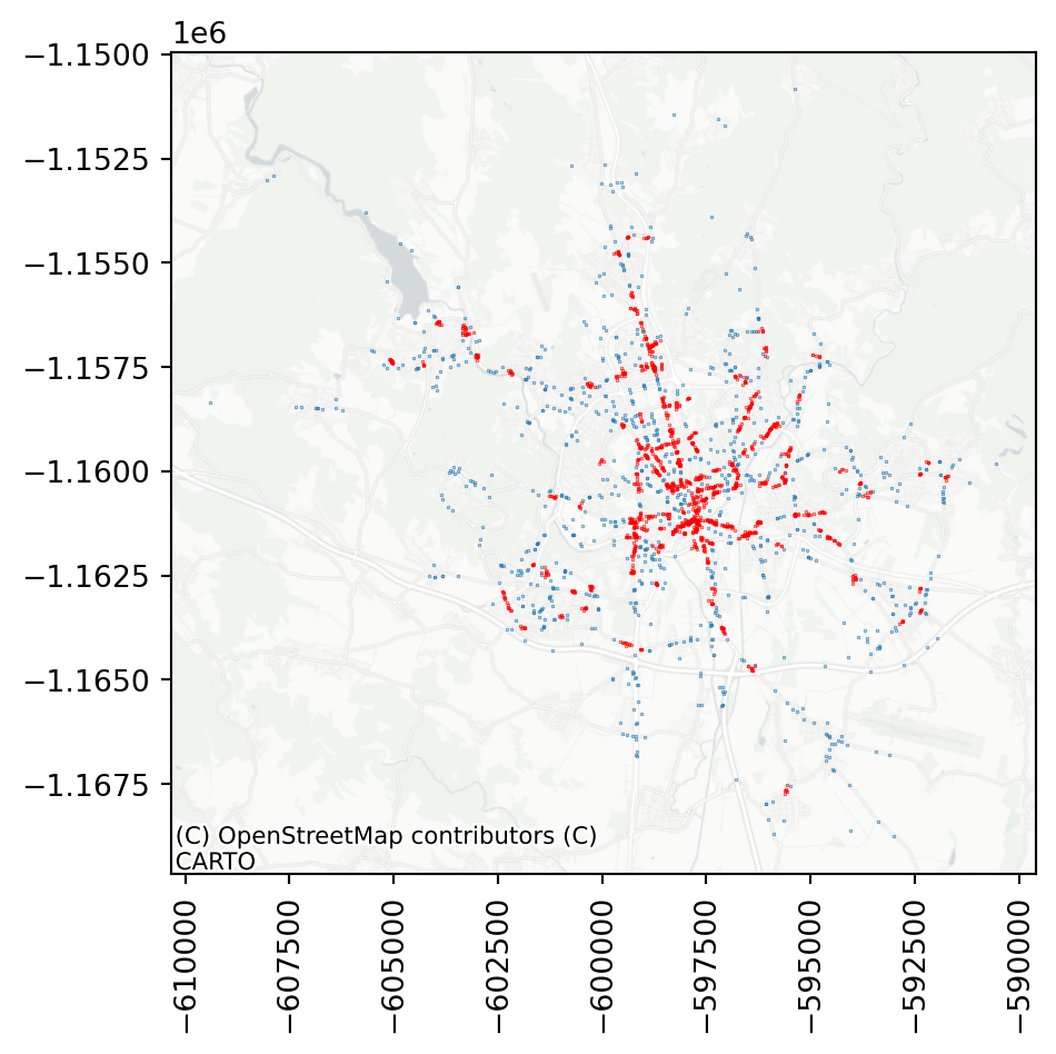
By default, DBSCAN uses 5 as the minimal number of points in a neighbourhood. If you adjust that, some of the smaller clusters disappear.
dbscan_100_20 = cluster.DBSCAN(eps=100, min_samples=20)
dbscan_100_20.fit(accidents[["x", "y"]])DBSCAN(eps=100, min_samples=20)In a Jupyter environment, please rerun this cell to show the HTML representation or trust the notebook.
On GitHub, the HTML representation is unable to render, please try loading this page with nbviewer.org.
Parameters
| eps | 100 | |
| min_samples | 20 | |
| metric | 'euclidean' | |
| metric_params | None | |
| algorithm | 'auto' | |
| leaf_size | 30 | |
| p | None | |
| n_jobs | None |
Assigning the cluster label as a column allows a comfortable plotting of cluster membership.
accidents['cluster'] = dbscan_100_20.labels_Code
ax = accidents[accidents["cluster"] == -1].plot(
markersize=0.05, color="lightgrey"
)
accidents[accidents["cluster"] != -1].plot(
"cluster", categorical=True, ax=ax, markersize=0.1, legend=True
)
contextily.add_basemap(
ax=ax,
crs=accidents.crs,
source="CartoDB Positron No Labels",
)
plt.xticks(rotation=90);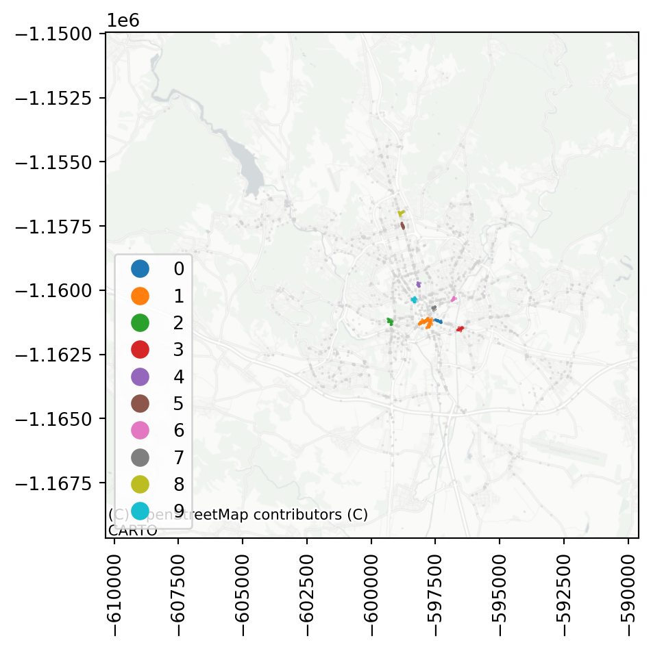
Try for yourself, how the cluster detection changes with a larger or a smaller epsilon or a different minimum number of samples within a cluster.
CautionAdvanced topic
The part below is optional and may not be covered in the class. It contains a slightly more advanced topic of space-time interaction, which is another type of analysis you may want to do with a point pattern that has a time dimension. Feel free to skip it if you don’t feel it is for you.
Space-time interactions
You have now tested that the point pattern is clustered in space, i.e., that there is a spatial interaction between the points. If you have your points allocated in space and time, you can extend this by testing spatio-temporal interaction.
You will need to derive time coordinates from the three columns containing the date of the incident.
- 1
-
pandascan create adatetimeobject based on columns named"year","month"and"day". - 2
-
You can then do time-based algebra on
datetimecolumns and use the.dtaccessor to retrieve the number of days since the first observations as integers.
0 93
1 156
2 156
3 489
4 609
Name: days_since_first, dtype: int64With the time coordinates ready, you can use the Knox test for spatiotemporal interaction.
knox = pointpats.Knox.from_dataframe(
accidents, time_col="days_since_first", delta=500, tau=100
)The test takes spatial coordinates, time coordinates and two parameters. delta is a threshold for proximity in space (use 500m), while tau is a threshold for proximity in time (use 100 days). Knox test then counts a number of events that are closer than delta in space and tau in time. This count is available as .statistic_.
knox.statistic_3860Finally, look at the pseudo-significance of this value, calculated by permuting the timestamps and re-running the statistics. In this case, the results indicate there is likely some space-time interaction between the events.
knox.p_sim0.01However, be careful. Combining multiple tests (like you did with Ripley’s alphabet and Quadrat statistic) before making any conclusions is always recommended.
TipAdditional reading
Have a look at the chapter Point Pattern Analysis from the Geographic Data Science with Python by Rey, Arribas-Bel, and Wolf (2023) for more details and some other extensions.
Acknowledgements
This section loosely follows the Point Pattern Analysis chapter from the Geographic Data Science with Python by Rey, Arribas-Bel, and Wolf (2023).
References
Rey, Sergio, Dani Arribas-Bel, and Levi John Wolf. 2023. Geographic Data Science with Python. Chapman & Hall/CRC Texts in Statistical Science. London, England: Taylor & Francis.