import geopandas as gpd
import tobler
import pyinterpolate
import numpy as np
import matplotlib.pyplot as plt
from libpysal import graph
from sklearn import neighbors
from scipy import interpolateSpatial interpolation
In your life as a spatial data scientist, you will find yourself in a situation where you have plenty of data to work with, just linked to different geometries or representing slightly different locations that you need. When this happens, you need to interpolate the data from one set of geometries, on which the data is shipped, to the other, the one you are interested in.
Any interpolation method is necessarily an approximation but some are better than others.
This chapter of the course covers two types of interpolation - from one set of polygons to another set of polygons, and from a sparse set of points to other locations in the same area.
Areal interpolation and dasymetric mapping
The first use case is the interpolation of data from one set of geometries to the other one, otherwise known as areal interpolation or dasymetric mapping.
Data zones and H3
You are already familiar with the Scottish Index of Multiple Deprivation, so let’s use it as an example of areal interpolation. Load the subset of SIMD 2020 for the City of Edinburgh.
simd = gpd.read_file(
"https://martinfleischmann.net/sds/interpolation/data/edinburgh_simd_2020.gpkg"
)
simd.head(2)| DataZone | DZName | LAName | SAPE2017 | WAPE2017 | Rankv2 | Quintilev2 | Decilev2 | Vigintilv2 | Percentv2 | ... | CrimeRate | CrimeRank | HouseNumOC | HouseNumNC | HouseOCrat | HouseNCrat | HouseRank | Shape_Leng | Shape_Area | geometry | |
|---|---|---|---|---|---|---|---|---|---|---|---|---|---|---|---|---|---|---|---|---|---|
| 0 | S01008417 | Balerno and Bonnington Village - 01 | City of Edinburgh | 708 | 397 | 5537 | 4 | 8 | 16 | 80 | ... | 86 | 5392.0 | 17 | 8 | 2% | 1% | 6350.0 | 20191.721420 | 1.029993e+07 | POLYGON ((315157.369 666212.846, 315173.727 66... |
| 1 | S01008418 | Balerno and Bonnington Village - 02 | City of Edinburgh | 691 | 378 | 6119 | 5 | 9 | 18 | 88 | ... | 103 | 5063.0 | 7 | 10 | 1% | 1% | 6650.0 | 25944.861787 | 2.357050e+07 | POLYGON ((317816 666579, 318243 666121, 318495... |
2 rows × 52 columns
NoteAlternative
Instead of reading the file directly off the web, it is possible to download it manually, store it on your computer, and read it locally. To do that, you can follow these steps:
- Download the file by right-clicking on this link and saving the file
- Place the file in the same folder as the notebook where you intend to read it
- Replace the code in the cell above with:
simd = gpd.read_file(
"edinburgh_simd_2020.gpkg",
)Get an interactive map with one of the variables to get more familiar with the data.
simd[["EmpNumDep", "geometry"]].explore("EmpNumDep", tiles="CartoDB Positron")Make this Notebook Trusted to load map: File -> Trust Notebook
This is the source - data linked to SIMD Data Zones. Let’s now focus on the target geometries. Popular spatial units of analysis are hexagonal grids and Uber’s hierarchical H3 grid especially.
TipMore on H3
H3 grids are a very interesting concept as they often allow for very efficient spatial operations based on known relationships between individual cells (encoded in their index). Check the official documentation if you want to learn more.
Pay specific attention to the meaning of the resolution.
You can create the H3 grid covering the area of Edinburgh using the tobler package.
1grid_8 = tobler.util.h3fy(simd, resolution=8)
grid_8.head(2)- 1
-
The
h3fyfunction takes theGeoDataFrameyou want to cover and aresolutionof the H3 grid. In this case, 8 could be a good choice but feel free to play with other resolutions to see the difference.
| geometry | |
|---|---|
| hex_id | |
| 881972746dfffff | POLYGON ((317600.728 672022.649, 318064.838 67... |
| 88197274c9fffff | POLYGON ((322864.813 666102.469, 323328.745 66... |
Let’s check how the H3 grid overlaps the data zones of SIMD.
m = simd.boundary.explore(tiles="CartoDB Positron")
grid_8.boundary.explore(m=m, color="red")Make this Notebook Trusted to load map: File -> Trust Notebook
Some grid cells are fully within a data zone geometry, some data zones are fully within a single grid cell but overall, there is a lot of partial overlap.
tobler and Tobler
The task ahead can be done in many ways falling under the umbrella of dasymetric mapping. PySAL has a package designed for areal interpolation called tobler. You have already used it to create the H3 grid but that is only a small utility function included in tobler. The name of the package is a homage to the Waldo R. Tobler, a famous geographer and an author of a Pycnophylactic interpolation covered below
Simple areal interpolation
But before getting to the Pycnophylactic interpolation, let’s start with the simple case of basic areal interpolation. The logic behind it is quite simple - the method redistributes values from the source geometries to target geometries based on the proportion of area that is shared between each source polygon and each target polygon. It is not a simple join as you would get with sjoin() or overlay() methods from geopandas but it is not far from it. Areal interpolation brings an additional step of taking the values and redistributing them instead of merging. That means that if the source geometry contains a count of 10 people and 40% of the geometry is covered by a target polygon A, 40% by a target polygon B and 20% by a target polygon C, each gets a relevant proportion of the original count (4, 4, and 2). Similarly are treated intensive variables (e.g. a percentage).
The function you need to use for this kind of areal interpolation lives in the area_weighted module of tobler and is called simply area_interpolate. Use it to interpolate a subset of data from simd to grid_8.
- 1
-
Specify the source
GeoDataFrame. - 2
-
Specify the target
GeoDataFrame. - 3
- Specify the list of extensive variables to be interpolated.
- 4
- Specify the list of intensive variables to be interpolated.
/home/runner/work/sds/sds/.pixi/envs/default/lib/python3.14/site-packages/tobler/area_weighted/area_interpolate.py:354: FutureWarning: Input has data type int64, but the output has been cast to float64. In the future, the output data type will match the input. To avoid this warning, set the `dtype` parameter to `None` to have the output dtype match the input, or set it to the desired output data type.
estimates = diags([vals], [0])| EmpNumDep | IncNumDep | EmpRate | IncRate | geometry | |
|---|---|---|---|---|---|
| hex_id | |||||
| 881972746dfffff | 4.763279 | 11.419124 | 5.764571 | 8.117332 | POLYGON ((317600.728 672022.649, 318064.838 67... |
| 88197274c9fffff | 0.422484 | 0.552479 | 3.000000 | 3.000000 | POLYGON ((322864.813 666102.469, 323328.745 66... |
The resulting interpolated GeoDataFrame contains the selected variables from simd but linked to the grid_8 geometries. You can check the result on a map and compare it to the one above.
interpolated.explore("EmpNumDep", tiles="CartoDB Positron")Make this Notebook Trusted to load map: File -> Trust Notebook
TipRaster masking
You may have noticed that even if the actual location where a grid cell lies does not contain any buildings, it gets a proportion of data based on the area of overlap. That may not be an issue in some cases but if you want to be more precise, you can use a raster layer as a mask to further influence the redistribution of values. See the documentation for details.
Pycnophylactic interpolation
Another option is to use Pycnophylactic interpolation (Tobler 1979), a method that creates a smooth contour map of the original data while preserving the volume but avoiding sharp boundaries and uses this to interpolate values onto the target polygons. Unlike area_interpolate, pycno_interpolate does not handle intensive variables.
- 1
-
Specify the source
GeoDataFrame. - 2
-
Specify the target
GeoDataFrame. - 3
- Specify the list of (extensive) variables to be interpolated.
- 4
- The size of a cell of the intermediate raster (see below).
WARNING: nan_treatment='interpolate', however, NaN values detected post convolution. A contiguous region of NaN values, larger than the kernel size, are present in the input array. Increase the kernel size to avoid this. [astropy.convolution.convolve]
/home/runner/work/sds/sds/.pixi/envs/default/lib/python3.14/site-packages/tobler/pycno/pycno.py:145: RuntimeWarning: divide by zero encountered in scalar divide
correct = (val - nansum(data[mask])) / mask.sum()
/home/runner/work/sds/sds/.pixi/envs/default/lib/python3.14/site-packages/tobler/pycno/pycno.py:156: RuntimeWarning: divide by zero encountered in scalar divide
correct = val / nansum(data[mask])
/home/runner/work/sds/sds/.pixi/envs/default/lib/python3.14/site-packages/tobler/pycno/pycno.py:156: RuntimeWarning: invalid value encountered in scalar divide
correct = val / nansum(data[mask])From the user perspective, both area_interpolate and pycno_interpolate look similar but the results will likely differ.
pycno_8.explore("EmpNumDep", tiles="CartoDB Positron")Make this Notebook Trusted to load map: File -> Trust Notebook
For a better understanding of the method, you can look at the intermediate array of smoothed values by accessing the pycno function from the depth of the tobler.pycno module.
arr, _, _ = tobler.pycno.pycno.pycno(
gdf=simd, value_field="EmpNumDep", cellsize=200, verbose=False
)WARNING: nan_treatment='interpolate', however, NaN values detected post convolution. A contiguous region of NaN values, larger than the kernel size, are present in the input array. Increase the kernel size to avoid this. [astropy.convolution.convolve]
/home/runner/work/sds/sds/.pixi/envs/default/lib/python3.14/site-packages/tobler/pycno/pycno.py:145: RuntimeWarning: divide by zero encountered in scalar divide
correct = (val - nansum(data[mask])) / mask.sum()
/home/runner/work/sds/sds/.pixi/envs/default/lib/python3.14/site-packages/tobler/pycno/pycno.py:156: RuntimeWarning: divide by zero encountered in scalar divide
correct = val / nansum(data[mask])The function returns a numpy array of smoothed values and two pieces of information related to CRS, that are not relevant here. The array itself can be explored directly using matplotlib:
_ = plt.imshow(arr)
TipTheory behind
For more details on the theory behind both areal and Pycnophylactic interpolation methods, check this resource by Comber and Zeng (2022).
Point interpolation
Another case of interpolation is an interpolation of values from a sparse set of points to any other location in between. Let’s explore our options based on the Airbnb data in Edinburgh.
Airbnb in Edinburgh
You are already familiar with the Airbnb data from the Is there a pattern? exercise. The dataset for Edinburgh looks just like that for Prague you used before. The only difference is that, for this section, it is pre-processed to create geometry and remove unnecessary columns.
airbnb = gpd.read_file(
"https://martinfleischmann.net/sds/interpolation/data/edinburgh_airbnb_2023.gpkg"
)
airbnb.head()| id | bedrooms | property_type | price | geometry | |
|---|---|---|---|---|---|
| 0 | 15420 | 1.0 | Entire rental unit | $126.00 | POINT (325921.137 674478.931) |
| 1 | 790170 | 2.0 | Entire condo | $269.00 | POINT (325976.36 677655.252) |
| 2 | 24288 | 2.0 | Entire loft | $95.00 | POINT (326069.186 673072.913) |
| 3 | 821573 | 2.0 | Entire rental unit | $172.00 | POINT (326748.646 674001.683) |
| 4 | 822829 | 3.0 | Entire rental unit | $361.00 | POINT (325691.831 674328.127) |
NoteAlternative
Instead of reading the file directly off the web, it is possible to download it manually, store it on your computer, and read it locally. To do that, you can follow these steps:
- Download the file by right-clicking on this link and saving the file
- Place the file in the same folder as the notebook where you intend to read it
- Replace the code in the cell above with:
airbnb = gpd.read_file(
"edinburgh_airbnb_2023.gpkg",
)You will be focusing on the price of each listing. Let’s check that column.
airbnb.price.head()0 $126.00
1 $269.00
2 $95.00
3 $172.00
4 $361.00
Name: price, dtype: strWhile the values represent numbers, they are encoded as strings starting with the $ sign. That will not work for any interpolation (or any other mathematical method). Use pandas to strip the string of the $ character, remove , and cast the remaining to float.
airbnb["price_float"] = (
1 airbnb.price.str.strip("$").str.replace(",", "").astype(float)
)- 1
-
Access string methods using the
.straccessor. Remove,by replacing it with an empty string.
That is set now, you have numbers as expected. Since the dataset represents all types of Airbnb listings, it may be better to select only one type. Filter out only those with 2 bedrooms that can be rented as the whole flat and have a price under £300 per night (there are some crazy outliers).
two_bed_homes = airbnb[
(airbnb["bedrooms"] == 2)
& (airbnb["property_type"] == "Entire rental unit")
& (airbnb["price_float"] < 300)
].copy()
two_bed_homes.head()| id | bedrooms | property_type | price | geometry | price_float | |
|---|---|---|---|---|---|---|
| 3 | 821573 | 2.0 | Entire rental unit | $172.00 | POINT (326748.646 674001.683) | 172.0 |
| 5 | 834777 | 2.0 | Entire rental unit | $264.00 | POINT (324950.724 673875.598) | 264.0 |
| 6 | 450745 | 2.0 | Entire rental unit | $177.00 | POINT (326493.725 672853.904) | 177.0 |
| 10 | 485856 | 2.0 | Entire rental unit | $157.00 | POINT (326597.124 673869.551) | 157.0 |
| 17 | 51505 | 2.0 | Entire rental unit | $155.00 | POINT (325393.807 674177.409) | 155.0 |
Another useful check before heading to the land of interpolation is for duplicated geometries. Having two points at the same place, each with a different value could lead to unexpected results.
two_bed_homes.geometry.duplicated().any()np.True_There are some duplicated geometries. Let’s simply drop rows with duplicated locations and keep only the first occurrence (the default behaviour of drop_duplicates).
two_bed_homes = two_bed_homes.drop_duplicates("geometry")Check how the cleaned result looks on a map.
two_bed_homes.explore("price_float", tiles="CartoDB Positron")Make this Notebook Trusted to load map: File -> Trust Notebook
There are some visible patterns of higher and lower prices, but it may be tricky to do interpolation since the data is a bit too chaotic. In general, point interpolation methods work only when there is a spatial autocorrelation in the data and stronger autocorrelation leads to better interpolation. As you know, spatially lagged variable of already autocorrelated variable shows higher levels of autocorrelation, hence using the spatial lag will be beneficial for this section.
1knn = graph.Graph.build_kernel(two_bed_homes, k=10).transform("r")
two_bed_homes["price_lag"] = knn.lag(two_bed_homes.price_float)
two_bed_homes.explore("price_lag", tiles="CartoDB Positron")- 1
- Build weights based on 10 nearest neighbours weighted by the distance, so those neighbours that are closer have more power to affect the lag.
Make this Notebook Trusted to load map: File -> Trust Notebook
This looks much better. Let’s start with some interpolation. Create another H3 grid, this time with a resolution of 10 (much smaller cells than before). You will use it as a target of interpolation.
grid_10 = tobler.util.h3fy(simd, resolution=10)All of the methods below do not expect geometries as an input, but arrays of coordinates. That is an easy task. An array from the grid can be extracted from the centroid of each cell:
grid_coordinates = grid_10.centroid.get_coordinates()
grid_coordinates.head()| x | y | |
|---|---|---|
| hex_id | ||
| 8a197276c1a7fff | 326052.930079 | 670588.808537 |
| 8a197275410ffff | 314427.595339 | 673586.742661 |
| 8a1972765407fff | 324635.935550 | 674404.589348 |
| 8a1972674a77fff | 313668.333106 | 662926.805136 |
| 8a197275e667fff | 313943.566761 | 666619.109552 |
And an array from the Airbnb subset can be retrieved directly from point data:
homes_coordinates = two_bed_homes.get_coordinates()
homes_coordinates.head()| x | y | |
|---|---|---|
| 3 | 326748.645636 | 674001.683211 |
| 5 | 324950.723888 | 673875.598033 |
| 6 | 326493.725178 | 672853.903917 |
| 10 | 326597.123684 | 673869.551295 |
| 17 | 325393.807222 | 674177.408961 |
Nearest
The simplest case is the nearest interpolation. That assigns a value to a given point based on the value of the nearest point in the original dataset. You can use the griddata function from the scipy.interpolate module to do that efficiently.
- 1
- Use the array of coordinates of Airbnb as input points.
- 2
- The lagged prices are the values linked to points.
- 3
-
xiis the array of point coordinates at which to interpolate data. - 4
-
Specify the
"nearest"as a method. Check the other options in the documentation yourself but be aware that not all may work well on your data (like in this case).
array([152.69331714, 122.26997908, 172.50043529, ..., 128.68204975,
128.68204975, 118.94131503], shape=(20162,))The result is provided as a numpy.ndarray object aligned with grid_coordinates, so you can directly assign it as a column.
grid_10["nearest"] = nearestCheck the result of the nearest interpolation on a map.
_ = grid_10.plot('nearest', legend=True)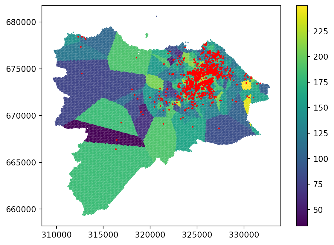
You can see that the result is actually a Voronoi tessellation. If you plot the original points on top, it is even clearer.
ax = grid_10.plot('nearest', legend=True)
_ = two_bed_homes.plot(ax=ax, color="red", markersize=1)
Nearest interpolation may be fine for some use cases, but it is not a good interpolation method in general.
K-nearest neighbours regression
Expanding the nearest method, which takes a single nearest neighbour and allocates the values, you can use the K-nearest neighbours regression (KNN) method. KNN takes into account multiple nearest neighbours and interpolates the value based on all of them.
Uniform
The simple KNN option is to find \(K\) nearest neighbours (say 10), treat all equally (uniform weights), and obtain the interpolated value as a mean of values these neighbours have. The implementation of KNN is available in scikit-learn, so it has the API you are already familiar with from the Clustering and regionalisation section.
- 1
- Create the regressor object.
- 2
- Use 10 neighbors and uniform weights.
As with the clustering, use the fit() method to train the object.
interpolation_uniform.fit(
1 homes_coordinates, two_bed_homes.price_lag
)- 1
- Fit the model based on coordinates and lagged price.
KNeighborsRegressor(n_neighbors=10)In a Jupyter environment, please rerun this cell to show the HTML representation or trust the notebook.
On GitHub, the HTML representation is unable to render, please try loading this page with nbviewer.org.
Parameters
Once the model is ready, you can predict the values on the grid coordinates.
price_on_grid = interpolation_uniform.predict(grid_coordinates)
price_on_gridarray([134.89249642, 122.82932148, 168.65956606, ..., 127.4122719 ,
127.4122719 , 127.4122719 ], shape=(20162,))This is, again, a numpy.ndarray that is aligned and can be directly set as a column.
grid_10["knn_uniform"] = price_on_gridCheck the result on a map.
_ = grid_10.plot("knn_uniform", legend=True)
This is already much better than the simple nearest join based on a single neighbor but there are still a lot of artefacts in the areas where you have only a few points far away from each other.
TipUsing
KNeighborsRegressor for the nearest join
You have probably figured out that you don’t need scipy.interpolate.griddata to do the nearest join if you have access to sklearn.neighbors.KNeighborsRegressor. With n_neighbors=1, the result should be the same. However, there are situations when only one is available, so it is good to know your options.
Distance-weighted
One way to mitigate the artefacts and take geography a bit more into the equation is to use distance-weighted KNN regression. Instead of treating each neighbour equally, no matter how far from the location of interest they are, you can weigh the importance of each by distance, or to be more precise, by the inverse of the distance. This ensures that points that are closer and considered more important for the interpolation than those that are further away.
interpolation_distance = neighbors.KNeighborsRegressor(
n_neighbors=10, weights="distance"
)The only difference is in the weight argument. The rest is the same.
interpolation_distance.fit(
homes_coordinates, two_bed_homes.price_lag
)KNeighborsRegressor(n_neighbors=10, weights='distance')In a Jupyter environment, please rerun this cell to show the HTML representation or trust the notebook.
On GitHub, the HTML representation is unable to render, please try loading this page with nbviewer.org.
Parameters
Train the model, predict the values for the grid and assign to the GeoDataFrame.
grid_10["knn_distance"] = interpolation_distance.predict(grid_coordinates)If you look at the resulting map, you can see that most of the artefacts are gone.
_ = grid_10.plot("knn_distance", legend=True)
Distance band regression
Distance can be employed in another way as well. Instead of selecting the neighbours from which the values are interpolated based on K-nearest neighbours, you can select them based on distance. For example, find all points in a radius of 1000 metres around a location of interest and draw the interpolated value from them. You can also further weigh these neighbours using the inverse distance. The code looks nearly identical. Just use neighbors.RadiusNeighborsRegressor instead of neighbors.KNeighborsRegressor.
interpolation_radius = neighbors.RadiusNeighborsRegressor(
radius=1000, weights="distance"
)
interpolation_radius.fit(
homes_coordinates, two_bed_homes.price_lag
)
grid_10["radius"] = interpolation_radius.predict(grid_coordinates)/home/runner/work/sds/sds/.pixi/envs/default/lib/python3.14/site-packages/sklearn/neighbors/_regression.py:513: UserWarning: One or more samples have no neighbors within specified radius; predicting NaN.
warnings.warn(empty_warning_msg)Check the result. The issue with sparsely populated areas on the map is a bit different this time. When there is no neighbour in 1000m, the model is not able to produce any prediction and returns np.nan. This may be seen as an issue but it can actually be a strength of the model as it is upfront with the issues caused by sparsity. Note that the model warns you about this situation during the prediction phase.
_ = grid_10.plot("radius", legend=True, missing_kwds={'color': 'lightgrey'})
Ordinary Kriging
The final method of this section is ordinary kriging. Kriging is based on a linear combination of observations that are nearby, like all the cases above, but the model is more complex and takes into account geographical proximity, but also the spatial arrangement of observations and the pattern of autocorrelation. As such, it can be seen as the most robust of the presented options.
You will use the package pyinterpolate to do kriging.
The first step is to build an experimental variogram based on the data and a couple of parameters.
- 2
-
step_sizeis the distance between lags within each point in included in the calculations. - 3
-
max_rangeis the maximum range of analysis.
The result can be plotted and explored using the plot() method. The experimental variogram is a plot that shows how the semivariance between pairs of sample points changes with distance. The variogram is calculated by taking pairs of sample points and computing the semivariance of the differences in their values at different distances. It measures the degree of relationship between points at different distances. Semivariance is half the variance of the differences in values between pairs of points at a set distance.
exp_semivar.plot()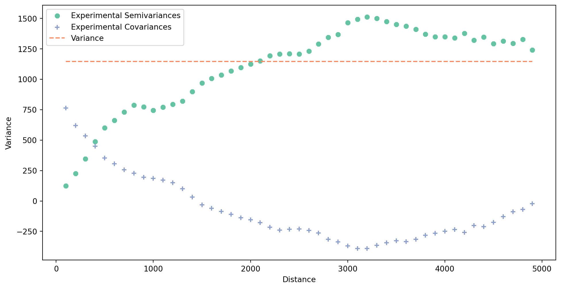
Next, you need to build a theoretical semivariogram based on the experimental variogram. pyinterpolate will test multiple models and their parameters and attempts to find the best one representing the data given the experimentatal semivariogram. Check the documentation of the function to learn how to customize the output.
semivar = pyinterpolate.build_theoretical_variogram(
1 experimental_variogram=exp_semivar,
)- 1
- The main input is the experimental variogram from the previous step.
Again, you can plot the result. The theoretical variogram is a model or a mathematical function that is fitted to the experimental variogram.
semivar.plot()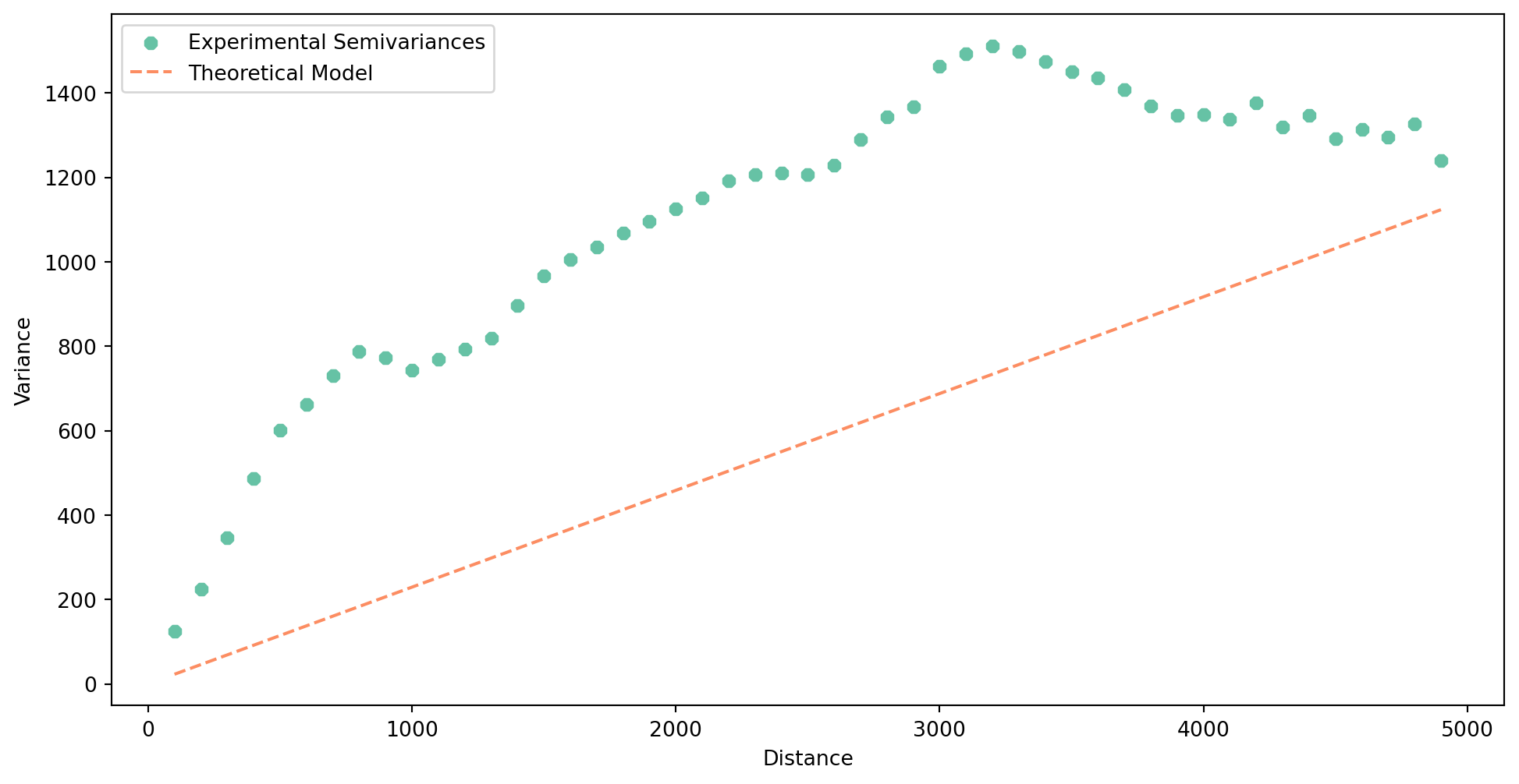
You can can try check how other models would look like, apart from the one selected automatically.
Let’s try another option.
- 1
- Change the model type to linear.
- 2
- Change the range of the semivariogram to get a better fit.
Let’s see if it is a bit better.
semivar_linear.plot()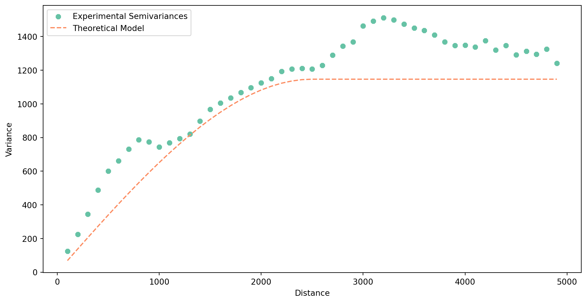
It is typically not but you may have other reasons to change it (e.g. performance).
Now you are ready to use kriging to interpolate data on your grid.
- 1
- Theoretical semivariogram.
- 2
- Input data representing Airbnb data, as used above.
- 3
- Points or coordinates of the grid to interpolate on.
- 4
- The number of the nearest neighbours used for interpolation.
- 5
-
Whether to show a progress bar or not. Feel free to use
Truebut it breaks the website :).
The resulting ordinary_kriging is a numpy.ndarray with four columns representing predicted value, variance error, x, and y. You can select the first one and assign it as a column.
grid_10["ordinary_kriging"] = ordinary_kriging[:, 0]And check the result.
_ = grid_10.plot("ordinary_kriging", legend=True)
Ordinary kriging looks great in dense areas but shows yet another type of artefact in sparse areas. While there are ways to mitigate the issue by changing the radius and other parameters of the model, it is worth noting that the reliability of any interpolation method in sparsely populated areas (in terms of the density of original points) is questionable. Kriging has a method to indicate the error rate using the variance error, which may help assess the issue. Variance error is the second column of the ordinary_kriging array.
grid_10["variance_error"] = ordinary_kriging[:, 1]
_ = grid_10.plot("variance_error", legend=True)
You can see from the plot of variance error that anything further away from existing points becomes fairly unreliable. You can, for example, set the specific threshold of the variance error you think is acceptable and treat all the other locations as missing or unreliable.
TipCheck the effect of the theoretical semivariogram model
Explore the difference between kriging using linear and spherical models in theoretical semivariograms. What are the other options and their effects?
TipAdditional reading
Have a look at the chapter Spatial Feature Engineering from the Geographic Data Science with Python by Rey et al. (2023) to learn a bit more about areal interpolation or look at the Areal Interpolation topic of The Geographic Information Science & Technology Body of Knowledge by Comber and Zeng (2022). The same source also contains a nice explanation of kriging by Goovaerts (2019).
References
Comber, A, and W Zeng. 2022. “Areal Interpolation.” In The Geographic Information Science & Technology Body of Knowledge, edited by John P. Wilson. https://doi.org/10.22224/gistbok/2022.2.2.
Goovaerts, P. 2019. “Kriging Interpolation.” In The Geographic Information Science & Technology Body of Knowledge, edited by John P. Wilson. https://doi.org/10.22224/gistbok/2019.4.4.
Rey, Sergio, Dani Arribas-Bel, and Levi John Wolf. 2023. Geographic Data Science with Python. Chapman & Hall/CRC Texts in Statistical Science. Taylor & Francis.
Tobler, Waldo R. 1979. “Smooth Pycnophylactic Interpolation for Geographical Regions.” Journal of the American Statistical Association 74 (367): 519–30. https://doi.org/10.1080/01621459.1979.10481647.